


I purchased a couple of prints from Etsy this year that really needed custom mattes, due to the size of the pictures. I ordered some from JoAnns and just picked them up today. I feel like I am so bad at picking out colors that will compliment or bring out artwork.
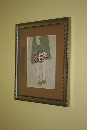
I'm afraid the dark tan here draws attention from the art. I had just learned that a dark border will draw you in. Or is it the frame that doesn't work? Or both? (Artwork: "Rose" by Askey).
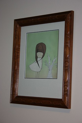
Here I'm afraid I've somehow made the light colors in the art look even more faded. And the frame, is it too much of a contrast taking attention away from the art? Overall this piece looks so much smaller than it did in the frame with the slightly too long matte. I do like the style of the frame. I think it is a carefree piece that needs a non-sophisticated, even fun frame. (Artwork: "Growing, Growing" by Ashley G.).
Have I really ruined this art with my lack of intuition or knowledge in this area? What would you have done?
Or perhaps I'm being too hard on myself and I just need to let these choices grow on me.
To see other artwork from the above artists in their Etsy stores, click on their names above.
I'm afraid the dark tan here draws attention from the art. I had just learned that a dark border will draw you in. Or is it the frame that doesn't work? Or both? (Artwork: "Rose" by Askey).
Here I'm afraid I've somehow made the light colors in the art look even more faded. And the frame, is it too much of a contrast taking attention away from the art? Overall this piece looks so much smaller than it did in the frame with the slightly too long matte. I do like the style of the frame. I think it is a carefree piece that needs a non-sophisticated, even fun frame. (Artwork: "Growing, Growing" by Ashley G.).
Have I really ruined this art with my lack of intuition or knowledge in this area? What would you have done?
Or perhaps I'm being too hard on myself and I just need to let these choices grow on me.
To see other artwork from the above artists in their Etsy stores, click on their names above.


0 ripples:
Post a Comment