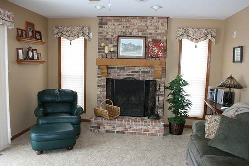
One thing in our home that has been bugging me has been the furniture layout in our family room. Almost all of our furniture was up against the wall except for the chair and a half, which you cannot see in the before photos below. It was placed in this room on the left just before the sliding glass doors which are there on the left too. I've learned that furniture should be arranged in a way that is more conducive to easier conversation and traffic flow. Well the traffic flow is WIDE open here! Since we removed the TV from here long ago, the focal point, I think, should be the fireplace. One really nice thing about having the couch facing the way it was, was the great view of the pond out back. Unfortunately it made it a little awkward for conversations AND did not make for a cozy arrangement around the fireplace and other seats. The longer table to the left of the couch was purchased for the sole purpose of being able to fit our CD holders which look a little like old fashioned library card drawers. This table has looked really awkward no matter WHERE we've put it. It finally occurred to me where it would look great, if only I could rearrange the furniture in a way that I think would work best. The main obstacle was that darn chair and a half. It was great where it was, but really that was the only place it was great. And that was sacrificing the potential for greatness of the placement of all the other furniture.
Before:


 Notice long table to left of couch looks a little awkward.
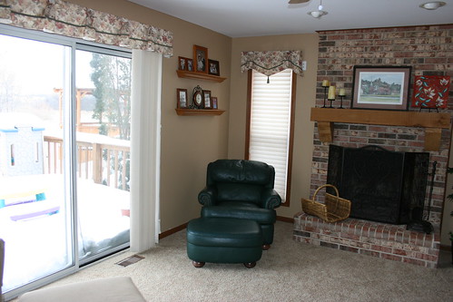
So.... I just decided to go for it. With the chair and a half being a bit of a problem. This is the way I think the furniture looks best, with the exception of the chair and a half. And it's matching ottoman makes a "good" coffee table in front of the couch, but the condition of the fabric on the piece is not good. So we have been talking about getting rid of these two pieces and getting a smaller chair for that corner. Because this arrangement seems much cozier to me.
After:


 Notice dead space behind the chair and a half. It is too big to push back into that corner. As I look at it more, maybe a larger piece of art or an arrangement of plates would help to fill in that space on the wall. *Upon further discussion with husband, we decided to move the shelves from the opposite wall over here a a more respectable height. We are actually hoping to have a bigger set of sliding doors installed on this wall to take advantage of the view.
There are some issues with a couple wires showing. One is for a lamp plugged into an outlet connected to the room switch. The other is a rogue cable connector jutting out from under the carpet as the previous owners placed their TV on a wall that did not have the original cable connector. There are a couple of places on either side (not really visible in the photos) that look to me like dead spaces. We are also not happy with having the two green upholstered pieces in here. The chenille couch is an sage green color and the leather chair is dark green. We do have a plaid couch in dark green, burgundy and tan in our living room that we are seriously considering switching in.
Thanks for checking out my little project which came to be while the rest of the family was taking a nap on a Saturday afternoon!


5 ripples:
Since doing this I've received one complement from my friend Gail who is very much into home dec and is a professional decorative seamstress. So that, and the fact that I've loved the coziness with the family and when guests are over has really made me feel more solid about this rearrange.
Love how you rearranged the furniture. A tall plant behind the chair and a half,in the corner, would look great. I have a cord running along my baseboard (hated it) so I got a basket and during the different seasons I put a floral arrangment in the basket, which hides the cord (it's a long narrow basket). I save the flowers for when that season rolls around again. Just a couple of suggestions I thought I'd pass along.
Wow!!! It looks so much warmer now... I'd love to redo my bedroom so you have now inspired me to get busy!
Hey, Kristi, I love this arrangement! Yes, you did it just right. As far as the empty corner, a plant was mentioned & I love plants for filling corners. If you get a live one (and you can because of your window), put it up on a pedestal or small table to give it some height. Baskets are great for hiding cords too, although sometimes they are really hard to hide.
I love the new arrangement! You were so right to make the fireplace the focal point. That's almost always correct.
Rhoda
LOVE the new layout. Seriously, makes it look much more inviting.
Post a Comment